Approve Flow - SaaS
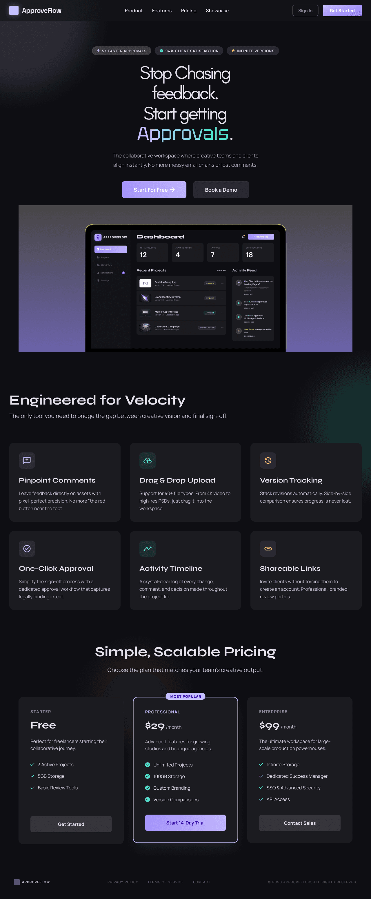
The product covers the full end-to-end workflow across 8 screens — a marketing landing page, authentication, a designer dashboard, project detail view with annotated comment pins, file upload modal, a no-login client review mode, notifications panel, and settings. Every screen was designed with two users in mind: the designer who needs clarity and control, and the client who needs simplicity and zero friction.
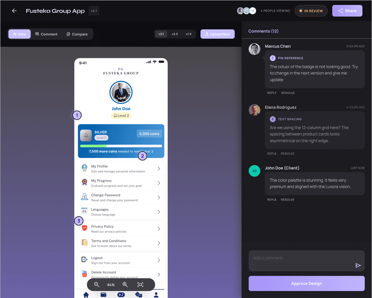
The client view required the most thought — it had to work without a sign-up, feel trustworthy, and make it dead easy to drop a comment on the exact part of a design they're talking about.
The Problem
Every freelance designer knows the drill. You send a design over email. The client replies three days later with "can you change the thing on the left?" You go back and forth five times trying to figure out what "the thing" is. There's no version history, no approval record, and no clarity on whether the project is actually done. ApproveFlow eliminates all of that.
Client Feedback and Approvals
The client view required the most thought — it had to work without a sign-up, feel trustworthy, and make it dead easy to drop a comment on the exact part of a design they're talking about.
Design Decisions
The visual language is intentionally dark and focused — a near-black base with violet and cyan accents. It's professional without being corporate, and polished enough that a designer would be proud to send clients a link to it. Syne handles the display type with authority; DM Sans keeps the UI readable and clean.
Status colors are semantic throughout: amber for "in review," green for approved, red for rejected. Nothing is ambiguous. The pinpoint comment system — where clients click directly on a design to drop a numbered pin — was the core interaction, so it got the most attention in terms of hierarchy, hover states, and feedback.


